

We will look at customizing the Navigation Bar view in SwiftUI navigation. In this way, we will be able to place the toolbar buttons in exact positions and edit the navigation title.
Customizing the Navigation Bar Appearance #
iOS wants the navigation bar to look a certain way, but we have the possibility to control its style to a certain extent.
First, we saw the large or inline navigation title styles, which gives us large or small text at the top. For example this will give us a small title.
NavigationStack {
    List(0..<100) { i in
        Text("Row \(i)")
    }
    .navigationTitle("Title goes here")
    .navigationBarTitleDisplayMode(.inline)
}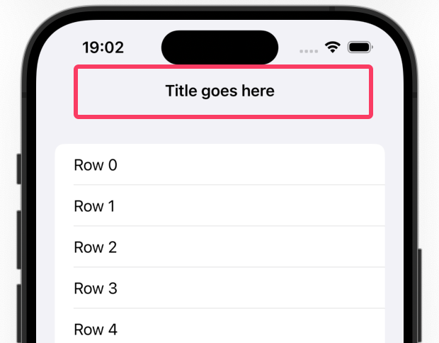
You will see that the navigation bar at the top is invisible by default, but as soon as you scroll up a bit it has a solid gray background, thus making the title clearly stand out from the content of the list.
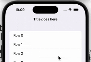
SwiftUI allows us to customize this a bit: we can specify an alternative color to use for this background. Note that this only appears when the list is scrolled under the navigation bar, so you won’t see it at first.
Add this under navigationBarTitleDisplayMode() to try it out;
.toolbarBackground(.blue)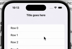
When you run the app and scroll a bit, you should see the navigation bar change to a solid blue color. You will also see that the title can be hard to read, because in light mode it will be black.
You can fix this by adding another modifier under the previous modifier, forcing the navigation bar to always use dark mode, which means the title text will be white.
.toolbarColorScheme(.dark)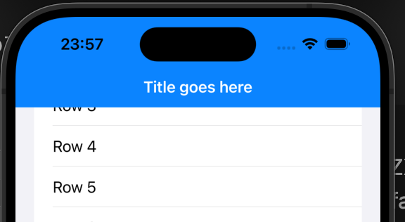
💡 Tip : You will encounter other types of toolbars later on. These two modifiers affect all bars, but if you want to change only the navigation bar, you should add for: .navigationBar as the second parameter to both modifiers.
There is one last way to customize the navigation bar: you can hide it always or according to the current state in your application.
To do this, add to the toolbar() modifier toolbar() set to .hidden to be used for all bars or only for the navigation bar;
.toolbar(.hidden, for: .navigationBar)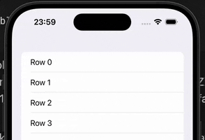
Hiding the toolbar will not prevent you from navigating to new views, but it may cause scrolling views to get under system information such as the time.
Placing Toolbar Buttons in Exact Locations #
If you place buttons on the NavigationStack toolbar, SwiftUI will automatically place them according to the platform your code is running on. We’re developing iOS apps here, which means that the buttons will be placed on the right side of the navigation bar for languages that read left to right, like English.
You can customize this by using a ToolbarItem. This sits around the toolbar buttons and allows you to place them exactly where you want them by choosing from a variety of options.
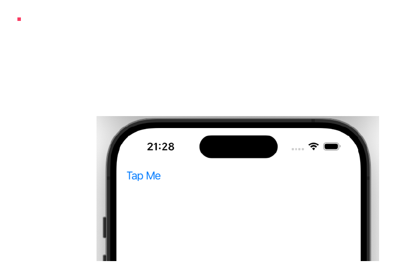
For example, we might want a left-based placement like this.
NavigationStack {
    Text("Hello, world!")
    .toolbar {
        ToolbarItem(placement: .topBarLeading) {
            Button("Tap Me") {
                // button action here
            }
        }
    }
}
While this works well, it is often better to use one of the semantic options - placement that has a specific meaning rather than just relying on their location. These include;
.confirmationActionwhen we want users to agree to something like terms of service..destructiveActionwhen the user needs to make a choice to destroy what they are working on, such as confirming that they want to remove some data they have created..cancellationActionwhen the user needs to revert from the changes they made, such as discarding the changes they made..navigationis used for buttons that allow the user to move between data, for example to go back and forward in a web browser.
These semantic overlays have two important benefits. First, because iOS has extra information about what your buttons do, it can add extra styling, for example a check button can be rendered in bold. Second, these positions are automatically adapted to other platforms, so our button always appears in the right place on iOS, macOS, watchOS and more.
💡 Tip : If you want the user to decide between saving or canceling a change, you might want to add the modifier navigationBarBackButtonHidden() so they can’t tap Back to exit without making a choice.
If you want multiple buttons using the same layout, you can repeat the ToolbarItem as follows.
.toolbar {
    ToolbarItem(placement: .topBarLeading) {
        Button("Tap Me") {
            // button action here
        }
    }

    ToolbarItem(placement: .topBarLeading) {
        Button("Or Tap Me") {
            // button action here
        }
    }
}
Or you can use ToolbarItemGroup like this.
.toolbar {
    ToolbarItemGroup(placement: .topBarLeading) {
        Button("Tap Me") {
            // button action here
        }

        Button("Tap Me 2") {
            // button action here
        }
    }
}
Both will give the same result.
Making Navigation Title Editable #
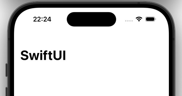
The basic navigationTitle() modifier allows us to display a string like the one below in the navigation bar.
struct ContentView: View {
    var body: some View {
        NavigationStack {
            Text("Hello, world!")
                .navigationTitle("SwiftUI")
        }
    }
}
However, if you are using the .inline title display mode, you can also pass a binding to the navigationTitle() method. This will then be displayed as usual, but with one important difference: iOS will show a small arrow next to the title and a “Rename” button to change the title.
Here’s how it looks in the code;
struct ContentView: View {
    @State private var title = "SwiftUI"

    var body: some View {
        NavigationStack {
            Text("Hello, world!")
                .navigationTitle($title)
                .navigationBarTitleDisplayMode(.inline)
        }
    }
}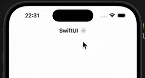
This is great for when the title reflects the name of something entered by the user, because it means we don’t need to add an extra text field to the layout.
You can also read this article in Turkish.
Bu yazıyı Türkçe olarak da okuyabilirsiniz.