

Today we have five topics to work on: Container, Relative Frames, ScrollView, NavigationLink and more.
SwiftUI Resize Images Based on Available Space #
When we create an Image view in SwiftUI, it will automatically resize itself according to the dimensions of its content. So, if the image is 1000x500, the Image view will be 1000x500. This is something we sometimes want, but often we want to show the image at a lower size. This is what we will explore in this topic and learn how to fit the image to the user’s screen using relative frames.
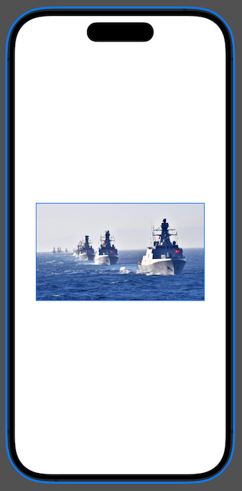
First, add an image to the project, it doesn’t matter what it is as long as it is wider than the screen. I call mine “Example”. I will use the following image in the project and its original size is 1200x695 px

Now draw this image on the screen;
struct ContentView: View {
    var body: some View {
        Image("Example")
    }
}
Tip : When you use constant image names like this, Xcode creates constant names for all of them that we can use instead of a string. In this case, that means typing Image(.example), which is much safer than using a string.

In the app preview, you can see that this image is too big for the available space. Images have the same frame() modifier as other views, so we can try to make it smaller this way.
Image(.example)
    .frame(width: 300, height: 300)
But this will not work, our image will still appear at full size. To find out why, change Xcode’s preview mode from “Live” to “Selectable”.
Important : This will stop your preview from running live, so you won’t be able to interact with the view until you select Live instead.
With Selectable mode enabled, look closely at the preview window, you will see that our image is full size, but now there is a 300x300 box in the center. The frame of the image view is set correctly, but the content of the image is still shown at its original size.
Let’s change the image like this;
Image(.example)
    .frame(width: 300, height: 300)
    .clipped()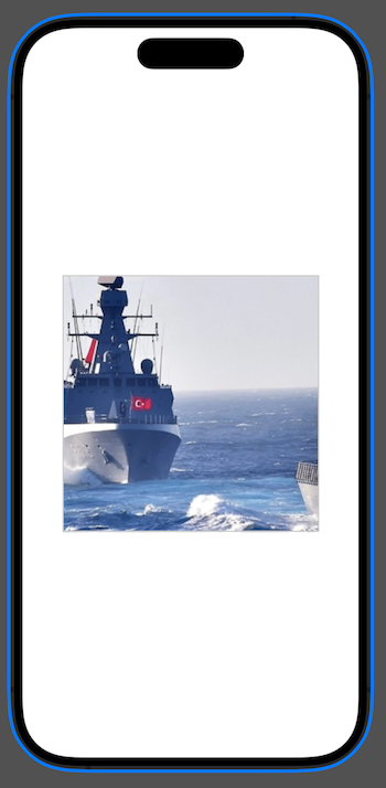
Now you will see everything more clearly: The image view is indeed 300x300, but that’s not really what we want.
If we want the image content to be resized as well, we need to use the resizable() modifier as follows;
Image(.example)
    .resizable()
    .frame(width: 300, height: 300)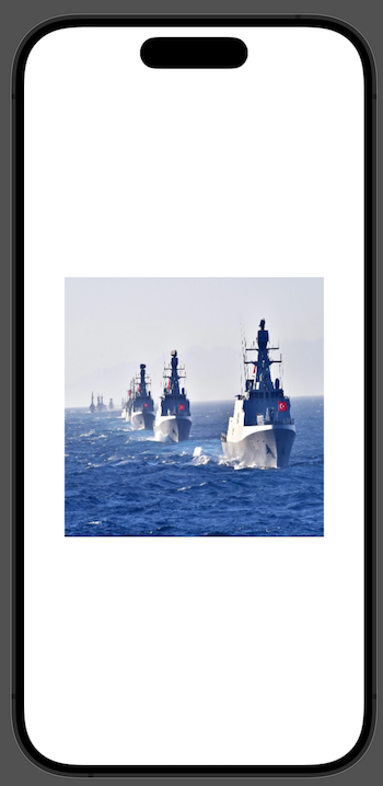
This is a bit better. Yes, the image resizes correctly now, but it probably looks stuck. The image was not square, so it looks distorted because it was resized to a square shape.
To fix this, we need to resize the image itself proportionally. This can be done using the scaledToFit() and scaledToFill() modifiers.
scaledToFit() means that the whole image will fit inside the container, even if it means leaving some parts of the image blank.
scaledToFill() means that there will be no empty parts in the view, even if it means leaving some of the image outside the container.
Try both to see the difference for yourself. Here is the fit mode applied;
Image(.example)
    .resizable()
    .scaledToFit()
    .frame(width: 300, height: 300)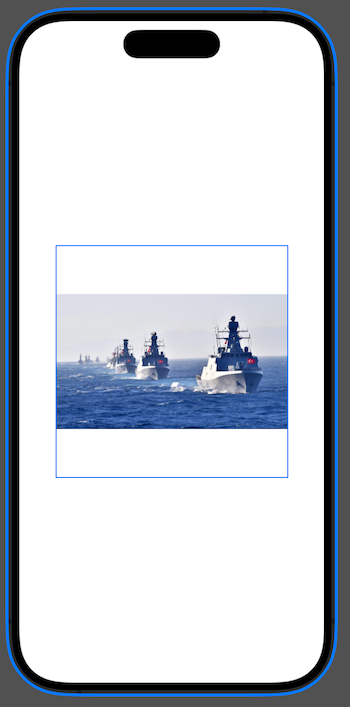
And here is scaledToFill() ;
Image(.example)
    .resizable()
    .scaledToFill()
    .frame(width: 300, height: 300)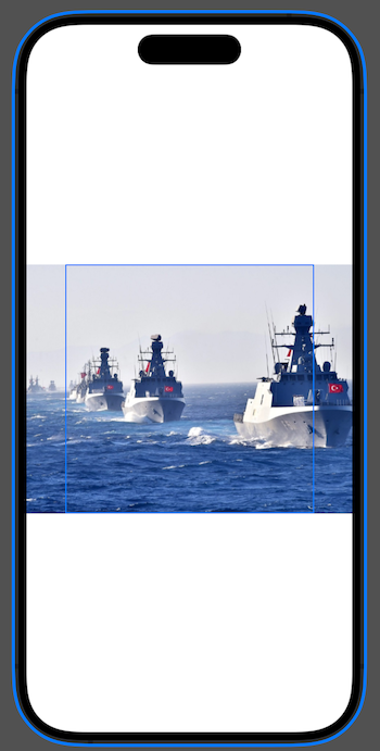
All this works great if we want fixed size images, but often we want images that automatically scale to fill more of the screen in one or both dimensions. So, instead of hard-coding a width of 300, what we really want to say is “make this image fill 80% of the width of the screen”.
SwiftUI has a special containerRelativeFrame() modifier that allows us to get exactly the result we want, instead of forcing a specific frame. The “Container” part can be the whole screen, but it can also be just the part of the screen occupied by the immediate parent of this view, or maybe our view is shown in a VStack with other views.
For example, we can create an image that is 80% of the width of the screen.
Image(.example)
    .resizable()
    .scaledToFit()
    .containerRelativeFrame(.horizontal) { size, axis in
        size * 0.8
    }
Let’s break this code down;
- We say that we want to give this image a frame according to the horizontal dimension of its parent. We do not specify a vertical dimension.
- SwiftUI then runs a closure that gives us a size and an axis. For us the axis will be
.horizontalbecause this is the axis we use, but this is more important when we create relative horizontal and vertical dimensions. Thesizevalue will be the size of the container, which is our entire screen. - For this axis we need to return the size we want, so we send 80% of the width of the container.
Again, we don’t need to specify a height here. This is because we have given SwiftUI enough information to find the height automatically. Since it knows the original width, our target width and our content mode, it understands how the target height of the image is proportional to the target width.
Displaying Data with SwiftUI ScrollView #
You have seen that List and Form allow us to create floating data tables. But for the data we create ourselves, we need a ScrollView.
The Scroll View can scroll horizontally, vertically or in both directions, and you can control whether the system shows scroll bars as well. When we place views in a scroll view, it automatically calculates the size of this content so that users can scroll from one edge to the other.
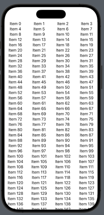
As an example, we can create a scrolling list of 100 text views as below.
ScrollView {
    VStack(spacing: 10) {
        ForEach(0..<100) {
            Text("Item \($0)")
                .font(.title)
        }
    }
}
When we run it in the simulator, we will see that we can freely scroll the scroll view, when we scroll down you will see that ScrollView handles the safe area just like List and Form. So the contents go under the Home Indicator.
You may also notice that touching the center directly is a bit annoying, it is more common to have the whole area scrollable. To achieve this behavior, we need to make the VStack take up more space.
ScrollView {
    VStack(spacing: 10) {
        ForEach(0..<100) {
            Text("Item \($0)")
                .font(.title)
        }
    }
    .frame(maxWidth: .infinity)
}
We can now tap and drag anywhere on the screen, which is more user-friendly.
All this seems really simple, but there is one important point we need to know. When we add views to a scroll view, they are created immediately. To demonstrate this, we can add a simple wrapper around a normal text view like this
struct CustomText: View {
    let text: String

    var body: some View {
        Text(text)
    }

    init(_ text: String) {
        print("Creating a new CustomText")
        self.text = text
    }
}
Now we can use it in ForEach:
ForEach(0..<100) {
    CustomText("Item \($0)")
        .font(.title)
}
The result will look the same, but now when you run the app you will see Xcode’s logs saying “Creating a new CustomText” hundreds of times. SwiftUI will not wait for you to scroll down to show these logs, it will generate them immediately.
If we want to prevent this from happening, there are LazyVStack and LazyHStack alternatives for VStack and HStack. These can be used in exactly the same way as normal Stacks, but they load their content on demand. That is, they don’t create views until they are actually shown, thus minimizing the amount of system resources used.
So, in this case we can replace our VStack with a LazyVStack as follows.
LazyVStack(spacing: 10) {
    ForEach(0..<100) {
        CustomText("Item \($0)")
            .font(.title)
    }
}
.frame(maxWidth: .infinity)
While the code for using Normal and Lazy stacks is the same, there is one important difference. Lazy stacks always try to take up as much space as possible, while normal stacks only take up as much space as they need. This is intentional, because it prevents lazy stacks from having to adjust their size when a new view is loaded that requires more space.
One last thing, you can create a horizontal ScrollView by passing .horizontal as a parameter when creating the ScrollView. After doing this, make sure you create a horizontal Stack.
ScrollView(.horizontal) {
    LazyHStack(spacing: 10) {
        ForEach(0..<100) {
            CustomText("Item \($0)")
                .font(.title)
        }
    }
}
SwiftUI NavigationLink Usage #
NavigationStack shows a navigation bar at the top of the views, but it also does something else: it allows us to stack the views. In fact, this is the most basic form of iOS navigation, which you can see when you tap Wi-Fi or General in Settings.
This view stack system is very different from the sheet we used before. Yes, they both show some kind of new view, but there is a difference in the way they are presented that affects how users think about these views.
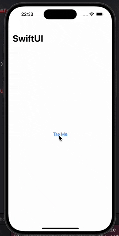
Let’s start by looking at some code so you can see for yourself, we can show a simple text view in a navigation stack like this;
struct ContentView: View {
    var body: some View {
        NavigationStack {
            Text("Tap Me")
                .navigationTitle("SwiftUI")
        }
    }
}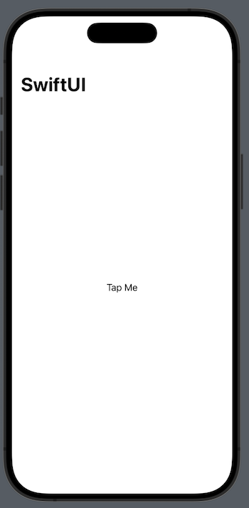
This text view is just static text, it is not a button with any action attached to it. We are going to make it so that when the user taps on it, it presents a new view. We will do this using NavigationLink. Give NavigationLink a destination and something to touch and it will do the rest.
To try this out, let’s change the view like this;
NavigationStack {
    NavigationLink("Tap Me") {
        Text("Detail View")
    }
    .navigationTitle("SwiftUI")
}
“Tap Me” now looks like a button and when we tap it, you will see a new view scroll from the right that says “Detail View”. Even better, you’ll see that the “SwiftUI” header has turned into a back button by moving downwards and we can tap it or swipe from the left edge to go back.
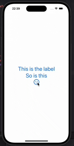
If you want something other than a simple text view as a label, you can use closure together with NavigationLink. For example, we can make a label consisting of several text views.
NavigationStack {
    NavigationLink {
        Text("Detail View")
    } label: {
        VStack {
            Text("This is the label")
            Text("So is this")
            Image(systemName: "face.smiling")
        }
        .font(.largeTitle)
    }
}
So, both sheet() and NavigationLink allow us to show a new view from the current view, but the way they do it is different and you should choose them carefully;
NavigationLinkis meant to show details about the user’s selection, as if you were exploring a topic in depth.sheet()is for showing irrelevant content, such as settings or screens for inputting information.
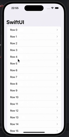
The most common place you see NavigationLink is in a list, and SwiftUI does something pretty cool here.
Let’s try changing our code to something like this;
NavigationStack {
    List(0..<100) { row in
        NavigationLink("Row \(row)") {
            Text("Detail \(row)")
        }
    }
    .navigationTitle("SwiftUI")
}
Working with Codable Data #
With the Codable protocol, if you are decoding a single instance of a type, or an array or dictionary of such instances, things are fine. But in this project we will be decoding a bit more complex JSON, an array within an array using different data types.
If you want to decode this kind of hierarchical data, the best way is to create separate types for each level you have. As long as the data matches the hierarchy you want, Codable can decode anything.
To demonstrate this, place this button in the content view.
Button("Decode JSON") {
    let input = """
    {
        "name": "Taylor Swift",
        "address": {
            "street": "555, Taylor Swift Avenue",
            "city": "Nashville"
        }
    }
    """

    // more code to come
}
The code above creates a JSON string. Let’s create structs that match the JSON above;
struct User: Codable {
    let name: String
    let address: Address
}

struct Address: Codable {
    let street: String
    let city: String
}
Now for the best part: The JSON string can be converted to Data type (the type that Codable works with) and then we can convert it to a User instance.
let data = Data(input.utf8)
let decoder = JSONDecoder()
if let user = try? decoder.decode(User.self, from: data) {
    print(user.address.street)
}
If you run this program and tap the button, you will see the address printed.
There is no limit to the number of levels that Codable can pass, the only important thing is that the structs you define match the JSON string.
Adding Views to Scrolling Grid #
SwiftUI’s List view is a great way to show scrolling rows of data, but sometimes we may also want columns of data. For example, we may need a grid view that can be adapted to show more data on larger screens.
In SwiftUI this can be realized with two views; LazyHGrid to show horizontal data and LazyVGrid to show vertical data. Just like with lazy stacks, the “lazy” part of the name is there because SwiftUI will automatically delay the loading of the included views until the moment they are needed, which means we can display more data without using too many system resources.
Creating a grid view is done in two steps. First, we need to define the rows or columns we want (we only define one of the two, depending on which type of grid we want)
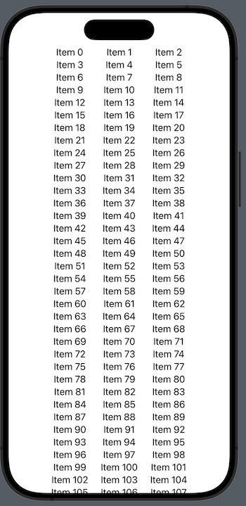
For example, if we have a vertically scrolling grid, we can say that we want our data to be placed in three columns exactly 80 pt wide by adding this property to the view.
let layout = [
    GridItem(.fixed(80)),
    GridItem(.fixed(80)),
    GridItem(.fixed(80))
]
After completing the layout, we need to place the grid in a ScrollView with as many elements as we want. Each item we create in the grid is automatically assigned a column.
For example, we can create 1000 items in a three-column grid as follows.
ScrollView {
    LazyVGrid(columns: layout) {
        ForEach(0..<1000) {
            Text("Item \($0)")
        }
    }
}
This works in some cases, but the best part of a grid is that it should work on a variety of screen sizes. This can be done with a different column layout using adaptive dimensions like below.
let layout = [
    GridItem(.adaptive(minimum: 80)),
]
This tells SwfitUI that we are happy to fit as many columns as possible as long as they are at least 80 pt wide. We can also set a maximum range for more control.
let layout = [
    GridItem(.adaptive(minimum: 80, maximum: 120)),
]
With this layout we can maximize the screen space.
The process is almost the same for horizontal grids. We just need to make ScrollView work horizontally and then create LazyHGrid using rows instead of columns.
ScrollView(.horizontal) {
    LazyHGrid(rows: layout) {
        ForEach(0..<1000) {
            Text("Item \($0)")
        }
    }
}
You can also read this article in Turkish.
Bu yazıyı Türkçe olarak da okuyabilirsiniz.