

Animations can be used not only for a beautiful display but also to convey information to the user. SwiftUI’s animation system makes it easy for us to create complex animations. Transitions help users understand changes in the interface.
In today’s post;
- Customize animations,
- Understand how to create animations,
- What transitions are and what they do,
- We will learn multiple animations, gesture animation and transition.
Control of Animation Stack #
At this point, we are going to bring together two things that we already understand separately, but which together can give us a bit of a headache.
Earlier we learned that the order of modifiers is important. So if we were to write code like this;
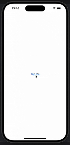
Button("Tap Me") {
    // do nothing
}
.background(.blue)
.frame(width: 200, height: 200)
.foregroundStyle(.white)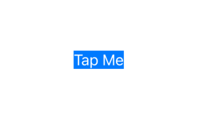
The result will look different from a code like the one below.
Button("Tap Me") {
    // do nothing
}
.frame(width: 200, height: 200)
.background(.blue)
.foregroundStyle(.white)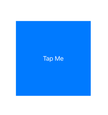
This is because if we color the background before adjusting the frame, only the original area is colored instead of the expanded area. If you remember, the underlying reason for this is that SwiftUI wraps views with modifiers, allowing us to apply the same modifier multiple times.
This is the first concept: modifier order is important because SwiftUI wraps views with modifiers in the order they are applied.
The second concept is that by applying an animation() modifier to a view we can have it implicitly animate changes.
To demonstrate this, we can modify our button code to show different colors depending on certain states. First we define the state;
@State private var enabled = falseWe can change this between true and false in the button’s action;
enabled.toggle()Then we can use a conditional value in the background() modifier to make the button blue or red;
.background(enabled ? .blue : .red)Finally, we add the animation() modifier to the button to animate these changes;
.animation(.default, value: enabled)
If you run the code, you will see that when you touch the button, its color changes between blue and red.
So, modifier order is important and we can add a modifier to a view several times. We can also create implict animations with the animation() modifier.
We can add the animation() modifier several times and the order in which it is used is important.
To demonstrate this, let’s add this modifier to our button after all other modifiers;
.clipShape(.rect(cornerRadius: enabled ? 60 : 0))
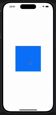
Depending on the state of this enabled Boolean, it will cause the button to change between square or rounded rectangle.
When you run the program you will see that touching the button causes it to move between red and blue, but it jumps between square and rounded rectangle.
Let’s move the clipShape() modifier before the animation;
.frame(width: 200, height: 200)
.background(enabled ? .blue : .red)
.foregroundStyle(.white)
.clipShape(.rect(cornerRadius: enabled ? 60 : 0))
.animation(.default, value: enabled)
Now when we run the code, both the background and clipShape are animated.
Therefore, the order in which we apply animations is important. Only modifiers before the animation() modifier are animated.
Now for the fun part. If we apply multiple animation() modifiers, each one controls everything before it until the next animation. This allows us to animate state changes differently for each type, not the same way for all properties.
For example, we can make the color change happen with the default animation, but use spring for the clip shape;
Button("Tap Me") {
    enabled.toggle()
}
.frame(width: 200, height: 200)
.background(enabled ? .blue : .red)
.animation(.default, value: enabled)
.foregroundStyle(.white)
.clipShape(.rect(cornerRadius: enabled ? 60 : 0))
.animation(.spring(duration: 1, bounce: 0.6), value: enabled)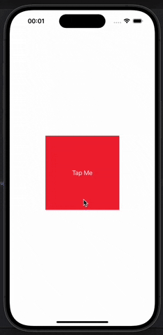
We can have as many animation() modifiers as we need to create the design. This allows us to split a state change into as many segments as we need.
For even more control, it is possible to disable animations completely by setting the modifier to nil. For example, we may want the color change to happen immediately but we want the clip shape to keep the animation, in this case we can write the following.
Button("Tap Me") {
    enabled.toggle()
}
.frame(width: 200, height: 200)
.background(enabled ? .blue : .red)
.animation(nil, value: enabled)
.foregroundStyle(.white)
.clipShape(.rect(cornerRadius: enabled ? 60 : 0))
.animation(.spring(duration: 1, bounce: 0.6), value: enabled)
SwiftUI Animating Gestures #
SwiftUI allows us to add gestures to any view and these gesture effects can also be animated. We have a number of gestures that we can work with, such as tap gestures that make any view respond to touches, drag gestures that respond to dragging our finger over a view, etc.
We’ll explore the topic of gestures in detail later, but for now let’s try something relatively simple. A card that we can drag on the screen, but which returns to its original position when we let go.
Let’s create our first layout;
struct ContentView: View {
    var body: some View {
        LinearGradient(colors: [.yellow, .red], startPoint: .topLeading, endPoint: .bottomTrailing)
            .frame(width: 300, height: 200)
            .clipShape(.rect(cornerRadius: 10))
    }
}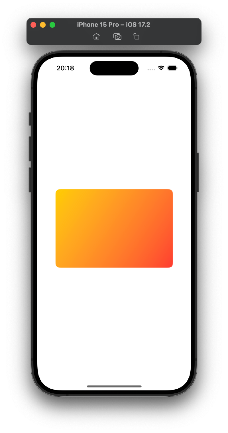
This draws a card-like view in the center of the screen. We want to move it around the screen according to the position of our finger and this requires three steps.
First, we need a state to store the drag amounts.
@State private var dragAmount = CGSize.zeroSecondly, we want to use this dimension to affect the position of the card on the screen. SwiftUI gives us a special modifier for this called offset(), which allows us to set the X and Y coordinate of a view without moving other views around it. You can pass separate X and Y coordinates if you want, but offset() can also take a CGSize directly.
The second step is to add this modifier to the linear gradient.
.offset(dragAmount)We can create a DragGesture and add it to the card. The drag gesture has two extra modifiers that will be useful here;
onChanged(): allows us to run a closure every time the user moves their fingeronEnded(): allows us to run a closure when the user removes their finger from the screen and ends the drag.
Both of these closures are given a single parameter describing the drag operation (where it started, where it is now, how far it has traveled) with the onChanged() modifier to tell us how far the drag has traveled from the starting point. We can assign this value directly to dragAmaount. So the view will move with the finger movement. For onEnded() we will completely ignore the input, because we will assign dragAmount the value zero.
Let’s add the following codes to linear gradient.
.gesture(
    DragGesture()
        .onChanged { dragAmount = $0.translation }
        .onEnded { _ in dragAmount = .zero }
)
If you run the code, you will see that you can now drag the gradient card and it will jump back to the center when you stop dragging. The offsets of the card are set by dragAmount, which in turn is set by the dragging motion.
Now that everything works, we can bring this movement to life with some animation and we have two options. Add implict animation to animate the drag and drop or add explict animation to animate just the drop.
Let’s add this modifier to the linear gradient to see the implict animation in action;
.animation(.bouncy, value: dragAmount)
To see the explict animation in action, remove the animation() modifier and add it to the existing onEnded() drag gesture code;
.onEnded { _ in
    withAnimation(.bouncy) {
        dragAmount = .zero
    }
}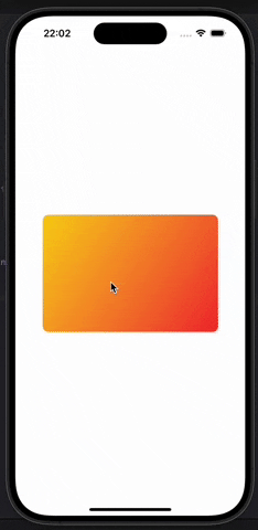
Now when we drag the card it will move without animation, but when we release the card it will return to its place with animation.
With offset animations, drag gesture and some delay, we can create fun animations without using too much code.
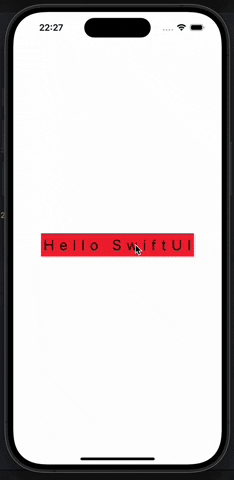
struct ContentView: View {
    let letters = Array("Hello SwiftUI")
    @State private var enabled = false
    @State private var dragAmount = CGSize.zero

    var body: some View {
        HStack(spacing: 0) {
            ForEach(0..<letters.count, id: \.self) { num in
                Text(String(letters[num]))
                    .padding(5)
                    .font(.title)
                    .background(enabled ? .blue : .red)
                    .offset(dragAmount)
                    .animation(.linear.delay(Double(num) / 20), value: dragAmount)
            }
        }
        .gesture(
            DragGesture()
                .onChanged { dragAmount = $0.translation }
                .onEnded { _ in
                    dragAmount = .zero
                    enabled.toggle()
                }
        )
    }
}
SwiftUI Views Transitions #
One of the most powerful features of SwiftUI is the ability to customize the way views are shown and hidden. Earlier, we saw how we can use normal if conditions to conditionally include views. This means that we can add or remove views from the hierarchy when the condition changes.
Transitions control how this addition and subtraction happens and we can work with built-in transitions, combine them in different ways and even create completely custom transitions.
To demonstrate this, let’s create a VStack with a button and a rectangle;
struct ContentView: View {
    var body: some View {
        VStack {
            Button("Tap Me") {
                // do nothing
            }

            Rectangle()
                .fill(.red)
                .frame(width: 200, height: 200)
        }
    }
}
We can make the rectangle appear only when a certain condition is met. First, we add some conditions that we can manipulate;
@State private var isShowingRed = falseWe then use this state as a condition to show our rectangle;
if isShowingRed {
    Rectangle()
        .fill(.red)
        .frame(width: 200, height: 200)
}
Finally, in the button’s action we can change isShowingRed between true and false
isShowingRed.toggle()If you run the app, you will see that pressing the button shows and hides the red square. There is no animation, it just appears and disappears suddenly.
We can get SwiftUI’s default view transition by wrapping the state change using withAnimation() as follows;
withAnimation {
    isShowingRed.toggle()
}
With this small change, the app now fades the red rectangle in and out while at the same time moving the button up to free up space. It looks good, but we can do better with the transition() modifier.
For example, just by adding the transition() modifier we can make the rectangle scale up and down as shown.
Rectangle()
    .fill(.red)
    .frame(width: 200, height: 200)
    .transition(.scale)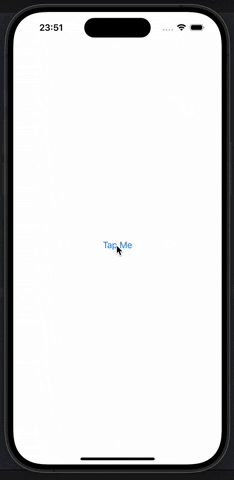
Now tapping the button looks much better. Press the button and the rectangle gets bigger, then shrinks when tapped again.
There are other transitions we can try. A useful one is .asymmetric, which allows us to use one transition when the view is shown and another when it disappears. To try it out, replace the current transition of the rectangle with this one.
.transition(.asymmetric(insertion: .scale, removal: .opacity))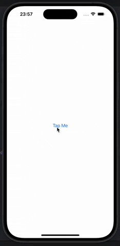
Creating a Custom Transition Using ViewModifier #
Creating completely new transitions for SwiftUI is possible and actually surprisingly easy, allowing us to add and remove views using completely custom animations.
This functionality is possible with the .modifier transition, which accepts any view modifier we want. The problem here is that we can use the instance of the modifier. This means that it has to be a modifier that we create ourselves.
To try this we can write a view modifier that allows us to emulate the Pivot animation in Keynote (the pivot animation causes a new slide to pivot from the top left corner). In SwiftUI, this means creating a view modifier that causes the view to pivot in from a corner without escaping the boundaries it should be in. SwiftUI actually gives us modifiers to do just that. rotationEffect() allows us to rotate a view in 2D space and clipped() stops the view from being drawn outside the rectangular area.
rotationEffect() is similar to rotation3DEffect() except that it always rotates around the Z axis. However, it also gives us the ability to control the anchor point of the rotation.( anchor point : which part of the view should be fixed in place as the center of the rotation ) SwiftUI gives us the UnitPoint type to control the anchor point, which allows us to specify an exact X/Y point for the rotation or use one of the many built-in options ( .topLeading, .bottomTrailing, .center etc.).
To do all this, we need an anchor point to control where the rotation takes place and a CornerRotateModifier to control how much rotation is applied;
struct CornerRotateModifier: ViewModifier {
    let amount: Double
    let anchor: UnitPoint

    func body(content: Content) -> some View {
        content
            .rotationEffect(.degrees(amount), anchor: anchor)
            .clipped()
    }
}
The addition of the clipped() modifier here means that when the view returns, the parts outside the natural rectangle will not be drawn.
We could try this directly using .modifier transition, but this is a bit unwieldy. A better idea is to wrap it with an extension to AnyTransition and have it turn from -90 to 0 in the top front corner;
extension AnyTransition {
    static var pivot: AnyTransition {
        .modifier(
            active: CornerRotateModifier(amount: -90, anchor: .topLeading),
            identity: CornerRotateModifier(amount: 0, anchor: .topLeading)
        )
    }
}
Now we can add the following code to any view to make it have a pivot animation.
.transition(.pivot)For example, we can use the onTapGesture() modifier to make a red rectangle rotate on the screen;
struct ContentView: View {
    @State private var isShowingRed = false

    var body: some View {
        ZStack {
            Rectangle()
                .fill(.blue)
                .frame(width: 200, height: 200)

            if isShowingRed {
                Rectangle()
                    .fill(.red)
                    .frame(width: 200, height: 200)
                    .transition(.pivot)
            }
        }
        .onTapGesture {
            withAnimation {
                isShowingRed.toggle()
            }
        }
    }
}
You can also read this article in Turkish.
Bu yazıyı Türkçe olarak da okuyabilirsiniz.