
With this project, we continue to progress in SwiftUI. We will learn new topics such as VStack, Image, LinearGradient. The application of this chapter will be a flag prediction application called GuessTheFlag. But before we move on to the application, we need to learn some basics.
SwiftUI Stack Usage #
If we are interested in more than one view element on the screen we have three useful ways; HStack, VStack and ZStack which deal with horizontal, vertical and depth.
When we create the first SwiftUI project, it looks like this;
var body: some View {
    VStack {
        Image(systemName: "globe")
            .imageScale(.large)
            .foregroundStyle(.tint)
        Text("Hello, world!")
    }
    .padding()
}
The code above returns only one type of view and that is text view. If we wanted to return two text views in a row, we could write like this;
var body: some View {
    Text("Hello, world!")
    Text("This is another text view")
}
Or we could write it like this using VStack;
var body: some View {
    VStack {
        Text("Hello, world!")
        Text("This is inside a stack")
    }
}
Both text views are placed in a VStack. The result may look the same, but there are three important differences;
- allows us to specify how much space we can leave between views.
- allows us to specify alignment, such as whether views should be placed to the left, right or center of each other.
- If we did not use
VStack, SwfitUI would be free to arrange the views. For example, two text views could appear side by side on the larger screen.
By default Vstack automatically puts some amount of space (spacing) between two views, but we can control the amount of space in the stack;
VStack(spacing: 20) {
    Text("Hello, world!")
    Text("This is inside a stack")
}
By default, VStack aligns the views centered, but we can control this with the alignment property. For example, we can use these text views left-aligned using .leading.
VStack(alignment: .leading) {
    Text("Hello, world!")
    Text("This is inside a stack")
}
In addition to aligning views vertically with VStack, we can use HStack for horizontal alignments. HStack has the same syntax as VStack, including spacing and alignment.
HStack(spacing: 20) {
    Text("Hello, world!")
    Text("This is inside a stack")
}
Vertical and horizontal stacks automatically fit their contents and prefer to align themselves in the center of the available space. If we want to change this and push all stack contents to one side, we can use one or more Spacers. For example, if we add a Spacer at the end of VStack, it will push all views to the top of the screen.
VStack {
    Text("First")
    Text("Second")
    Text("Third")
    Spacer()
}
If we add more than one Spacer, the available space is divided between them. For example, with the following code we can use 1/3 of the space at the top and 2/3 at the bottom.
VStack {
    Spacer()
    Text("First")
    Text("Second")
    Text("Third")
    Spacer()
    Spacer()
}
We can also use Ztack to organize views by depth. ZStack creates overlapping views. In the case of two text views, this will make it very difficult to read;
ZStack {
    Text("Hello, world!")
    Text("This is inside a stack")
}
Since views are overlapped in ZStack, there is no Spacer, but it has the alignment property. So if there are two views in ZStack, one large and one small, we can make them aligned on top as follows; ZStack(alignment: .top) {
ZStack draws its contents from top to bottom and back to front. This means that if we have an image and then some text, ZStack will draw them in this order and place the text on top of the image.
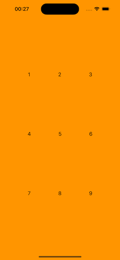
Let’s create a 3x3 grid with VStack and HStack;
SwiftUI Color and Frame #
SwiftUI offers us simple and powerful features to operate with colors.
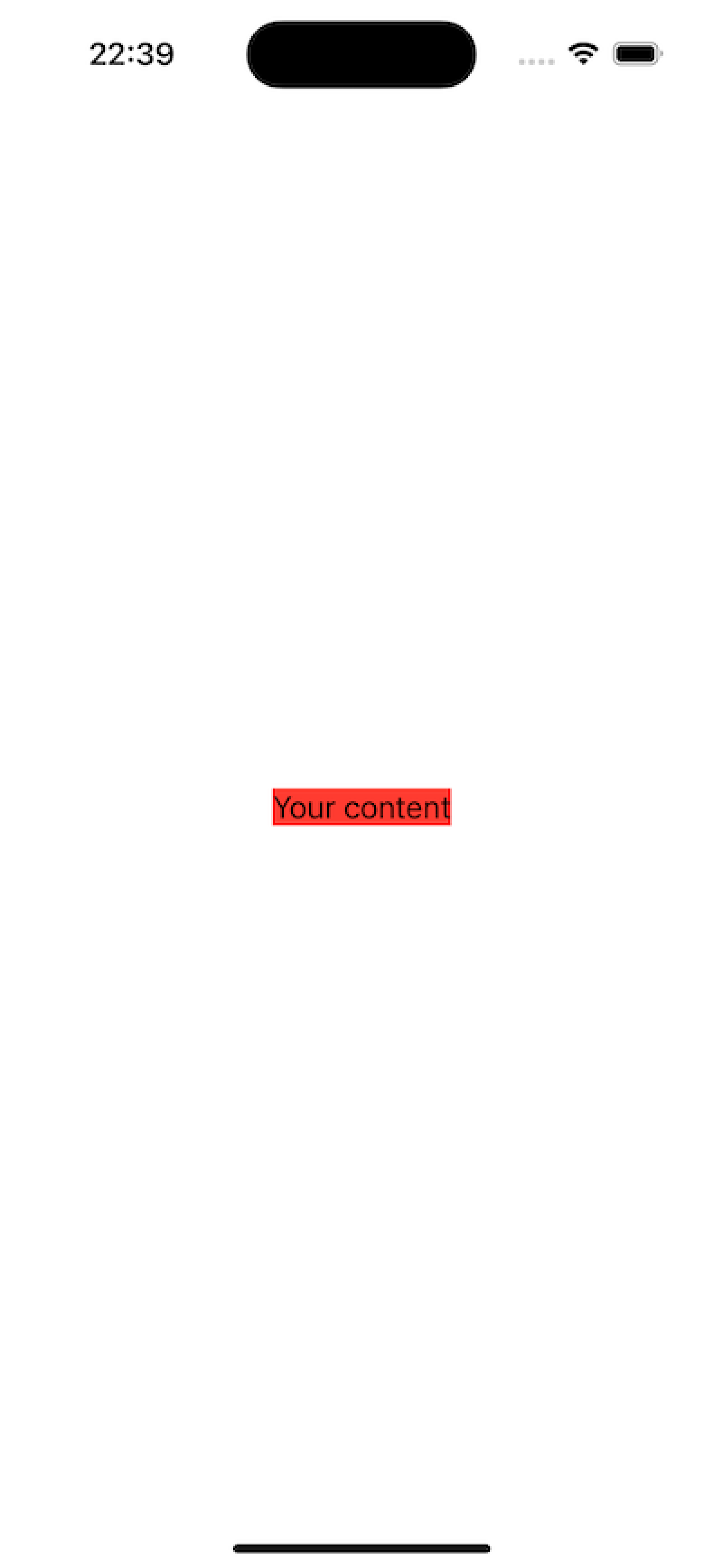
Let’s start with a text in ZSTack;
ZStack {
    Text("Your content")
}
What if we want to put something red behind the text?
One of our options is to use the background() modifier. This modifier can draw a color like the one below;
ZStack {
    Text("Your content")
}
.background(.red)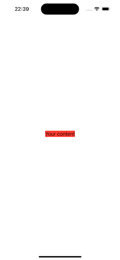
This seems to do what we expected, but there is a difference. Even though we wanted to change the background color of the whole ZStack, only the background color of the text changed.
Actually there is no difference between the code above and the one below;
ZStack {
    Text("Your content")
        .background(.red)
}
If we want to fill the entire area behind the text with red color, we need to place the color in ZStack. The color is treated as a view by itself.
ZStack {
    Color.red
    Text("Your content")
}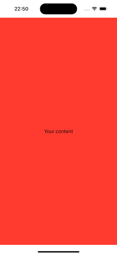
Color.red is a view by itself. Therefore it can be used like shapes and text.
When using the
background()modifier, SwiftUI could understand that.redactually meansColor.red. When we use color as an independent view, there is no context for Swift to understand what.redmeans, so we should useColor.red.
Colors automatically take up all available space, but we can use the frame() modifier to request specific sizes. For example, we can request a 200x200 red frame like below.
Color.red
    .frame(width: 200, height: 200)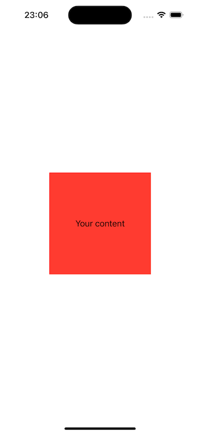
We can change the values of frame() as we want. For example, we can create a frame with a minimum width of 200pt but if possible use the maximum width and a maximum height of 200pt as follows.
Color.red
    .frame(minWidth: 200, maxWidth: .infinity, maxHeight: 200)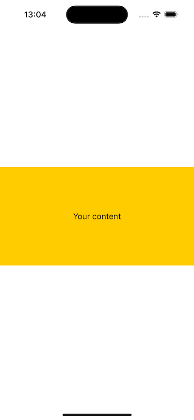
SwiftUI provides us with a number of built-in colors such as Color.blue, Color.green, Color.indigo, etc. We also have purpose-built colors that we can use.
For example, Color.primary is the default color of text in SwiftUI and will be black or white depending on whether the user’s device is running in light mode or dark mode. There is also Color.secondary which is black or white depending on the device, but this has a slight transparency so that some of the color behind it shines through.
If we want, we can create our own special color as follows;
Color(red: 1, green: 0.8, blue: 0)When using Color.red, we will see that white areas remain at the top and bottom of the screen. This area is intentionally left empty. The remaining part (i.e. the red area) is called safe area. We can draw in this area without worrying about being cropped by the notch or dynamic island on the iPhone.
If we want our content to also use the safe area, we can use the .ignoresSafeArea() modifier.
ZStack {
    Color.red
    Text("Your content")
}
.ignoresSafeArea()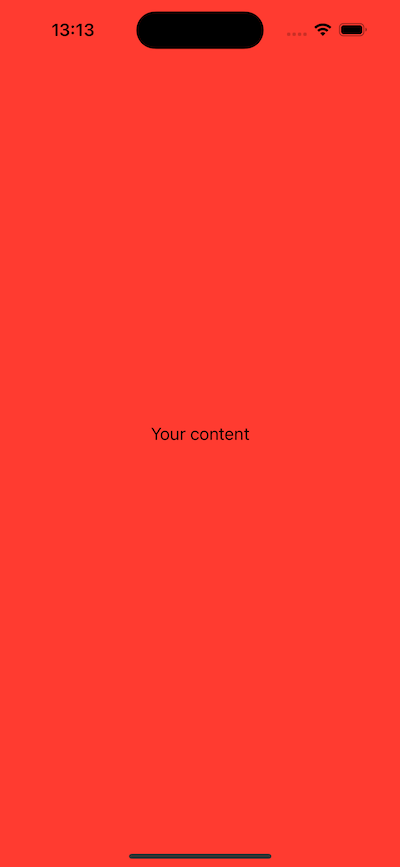
It is very important that no important content is placed outside the safe area as it makes it very difficult for the user to see the content.
If our content is purely decorative, like our background color here, it’s okay to extend it outside the safe space.
With the background() modifier we can use fixed colors like .red .green as well as material. With material we can create depth effects by applying a frosted glass effect.
Let’s see it in action;
ZStack {
    VStack(spacing: 0) {
        Color.red
        Color.blue
    }

    Text("Your content")
        .foregroundStyle(.secondary)
        .padding(50)
        .background(.ultraThinMaterial)
}
.ignoresSafeArea()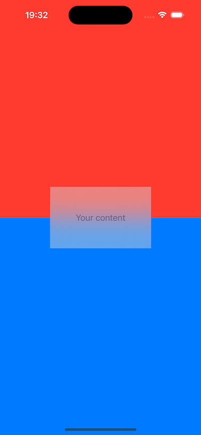
SwiftUI Gradient #
SwiftUI offers us four types of gradients and, like colors, they are views that can be drawn in the user interface.
Components that make up the gradient;
- array of colors to display
- size and direction information
- Type of gradient to use
For example, the linear gradient goes in one direction, so we give it a starting point as follows.
LinearGradient(colors: [.white, .black], startPoint: .top, endPoint: .bottom)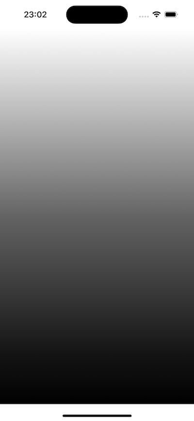
We can also set stop points to our gradient if we want. For example, we can make the gradient white from the start until 45% of the available space, then black from 55% of the available space.
LinearGradient(stops: [
    Gradient.Stop(color: .white, location: 0.45),
    Gradient.Stop(color: .black, location: 0.55),
], startPoint: .top, endPoint: .bottom)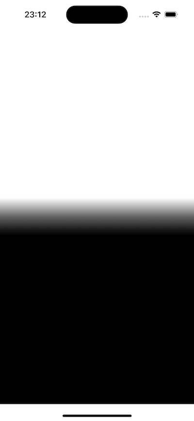
This will create a sharper gradient, squeezed into a small area in the center.
Swfit knows that we are creating a gradient stop here, so we can just type .init instead of Gradient.Stop as a shortcut.
LinearGradient(stops: [
    .init(color: .white, location: 0.45),
    .init(color: .black, location: 0.55),
], startPoint: .top, endPoint: .bottom)
Alternatively, with the radial gradient we can create outward gradients in a circle. Therefore, instead of specifying a direction, we specify a starting and ending radius. For example;
RadialGradient(colors: [.blue, .black], center: .center, startRadius: 20, endRadius: 200)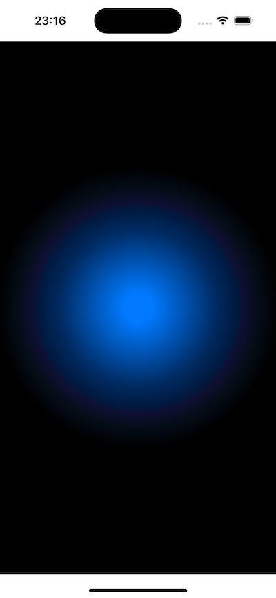
Finally, there is another type of gradient called the angular gradient. In some places it may also be called a conic gradient.
For example, we can use the following;
AngularGradient(colors: [.red, .yellow, .green, .blue, .purple, .red], center: .center)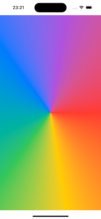
All these gradient types can have stops instead of simple colors. They can also work as independent views in our layouts or be used as part of a modifier.
SwiftUI also includes a fourth gradient type, which is simpler than the above types. But we don’t have any control over it, and we can only use them as background and foreground styles instead of individual views.
This type is created by adding .gradient after any color.
Text("Your content")
    .frame(maxWidth: .infinity, maxHeight: .infinity)
    .foregroundStyle(.white)
    .background(.black.gradient)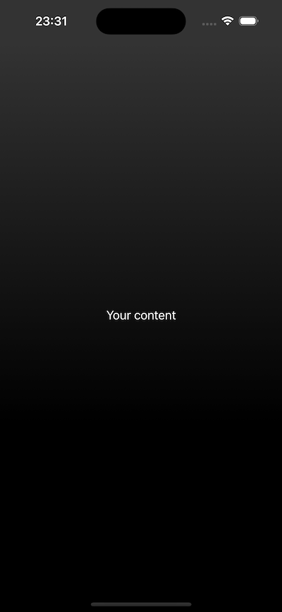
This type of gradient is very subtle, but it allows us to give a different feel to our design with almost no effort.
SwiftUI Buttons and Images #
The simplest way to create a button is to provide the title of the button and a clousure to be executed when the button is tapped.
Button("Delete selection") {
    print("Now deleting…")
}
Of course, we can also use a function instead of a closure for the action.
struct ContentView: View {
    var body: some View {
        Button("Delete selection", action: executeDelete)
    }

    func executeDelete() {
        print("Now deleting…")
    }
}
There are a few different ways to customize the appearance of buttons. First, we can add a role to the button that we can use to adjust the appearance of iOS for both visual and screen readers. For example, we can say that our delete button has a destructive role.
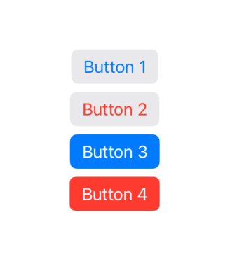
Button("Delete selection", role: .destructive, action: executeDelete)Secondly, we can use one of the built-in styles for buttons: .bordered and .borderedProminent
VStack {
    Button("Button 1") { }
        .buttonStyle(.bordered)
    Button("Button 2", role: .destructive) { }
        .buttonStyle(.bordered)
    Button("Button 3") { }
        .buttonStyle(.borderedProminent)
    Button("Button 4", role: .destructive) { }
        .buttonStyle(.borderedProminent)
}
We can use the tint() modifier to customize the colors of the bordered button.
Button("Button 3") { }
    .buttonStyle(.borderedProminent)
    .tint(.mint)
Apple explicitly recommends not to use too many prominent buttons, because when everything is prominent, nothing is prominent.
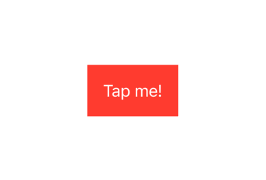
If we want to make a completely custom button, we can pass a custom title using a second closure
Button {
    print("Button was tapped")
} label: {
    Text("Tap me!")
        .padding()
        .foregroundStyle(.white)
        .background(.red)
}
SwiftUI has a special Image type to handle images in our applications. There are three ways to create Image;
Image("pencil")will return an image named “Pencil “ that we added to our project.Image(decorative: "pencil")loads the same image, but users who have enabled the screen reader will not read it. This is useful for images that do not carry important information.Image(systemName: "pencil")will fetch the pencil icon built into iOS. This uses Apple’s SF Symbols icon collection.
By default, if the screen reader is enabled it will read the name of our image, so if we don’t want to confuse the user we should give our images clear names. Or use the Image(decorative:) initializer.
We can use Image together with the buttons;
Button {
    print("Edit button was tapped")
} label: {
    Image(systemName: "pencil")
}
If we want both text and image in the button at the same time, we have two options. The first is to provide both directly to the Button.
Button("Edit", systemImage: "pencil") {
    print("Edit button was tapped")
}.buttonStyle(.bordered)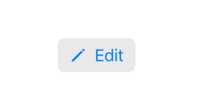
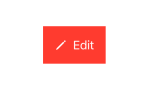
But if we want something more specialized, we can use SwiftUI’s special type called Label.
Button {
    print("Edit button was tapped")
} label: {
    Label("Edit", systemImage: "pencil")
        .padding()
        .foregroundStyle(.white)
        .background(.red)
}
SwiftUI Alert Message #
A common way to notify the user when something important happens is to use an alert. An alert consists of a title, a message and one or two buttons depending on the situation.
We can’t assign alert to a variable and say myAlert.show(), because that would be a bit against the logic of SwiftUI.
Instead, we create a state that monitors whether the alert is shown or not, as follows.
@State private var showingAlert = falseWe then add the alert to the UI and tell it to use this state to determine whether to show the alert or not. SwiftUI will monitor showingAlert and show the alert as soon as it becomes true.
Let’s create our code by putting all these together;
struct ContentView: View {
    @State private var showingAlert = false

    var body: some View {
        Button("Show Alert") {
            showingAlert = true
        }
        .alert("Important message", isPresented: $showingAlert) {
            Button("OK") { }
        }
    }
}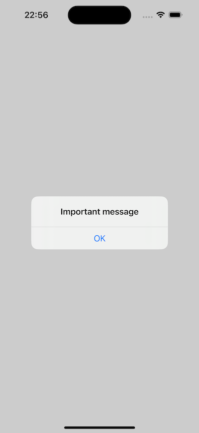
The code above adds the alert to the button, but it doesn’t matter where the .alert() modifier is used. All we are doing is saying that an alert exists and is shown when showingAlert is true.
Let’s take a closer look at the .alert() modifier;
alert("Important message", isPresented: $showingAlert)The first part is the alert’s header. SwiftUI automatically makes showingAlert false when the alert is closed, so there is two-way binding.
Now let’s look at the button;
Button("OK") { }Here we have an empty closure. So we are not adding any functionality that will work when the button is pressed. This doesn’t matter though, because any button inside an alert will automatically close the alert. This closure is there to allow us to add any extra functionality beyond closing the alert.
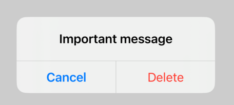
We can add more buttons to Alert. This is also a particularly good place to make it clear what each button does.
.alert("Important message", isPresented: $showingAlert) {
    Button("Delete", role: .destructive) { }
    Button("Cancel", role: .cancel) { }
}
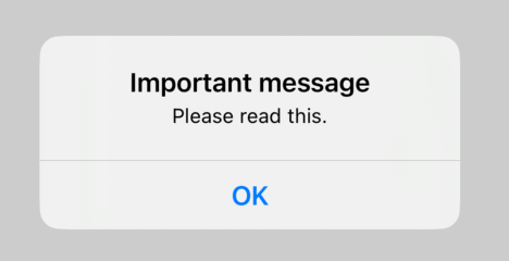
Finally, we can add message text with our title using a closure like the following
Button("Show Alert") {
    showingAlert = true
}
.alert("Important message", isPresented: $showingAlert) {
    Button("OK", role: .cancel) { }
} message: {
    Text("Please read this.")
}
You can also read this article in Turkish.
Bu yazıyı Türkçe olarak da okuyabilirsiniz.