

In this section, we are starting to create WeSplit, our bill splitting application. In this section, we will examine how to read text with TextField, create Picker in Form, SwiftUI Segmented Control and how to hide the keyboard.
This project is also available on GitHub.
GitHub - GorkemGuray/WeSplit: 100 Days of SwiftUI - Project-1
Reading Text from User with TextField #
We mark the properties that we expect users to enter as data into our application as @State.
Let’s start by adding these three properties to ContentView;
@State private var checkAmount = 0.0
@State private var numberOfPeople = 2
@State private var tipPercentage = 20
We have assigned reasonable default values to these properties.
But the tip rate can be chosen by the user as a different percentage, so let’s define the possible options in an Array and add it under the other three properties.
let tipPercentages = [10, 15, 20, 25, 0]Let’s start by creating a field where users can enter the amount of the bill. But when you write the code below, you will see that it does not work.
Let’s change the body property as follows;
Form {
    Section {
        TextField("Amount", text: $checkAmount)
    }
}
The code above will not work because TextField takes inputs as text and tends to assign it to a String. We need to convert the expression we get from the TextField as a string into a number that we can work with.
But we can do this in a better way. We can pass our Double value to TextField and ask it to take the input in currency. Notice that we use value as a parameter here instead of text. If we use the value parameter, we must also use format.
TextField("Amount", value: $checkAmount, format: .currency(code: "USD"))This looks really good, but we have a problem. Are all users using the USD currency? Here we can ask iOS if it can give the user’s currency.
.currency(code: Locale.current.currency?.identifier ?? "USD"))Locale is a huge struct built into iOS that is responsible for storing all the user’s regional settings (which calendar, metric system, etc.). In our case, we ask if it is the code for the user’s preferred currency, and if not, we will return “USD”.
The first parameter in TextField is a string called placeholder. The placeholder is the gray text shown in the TextField and gives the user an idea of what should be there. The second parameter is checkAmount property two-way bindings, meaning that this property will be updated as the user types. The third parameter here is the one that controls the way the text is formatted and makes it a currency.
One of the great things about the @State property wrapper is that it automatically tracks changes and automatically recalls the body property when something happens. This reloads the UI to reflect the changed state. This is actually a fundamental feature of the way SwiftUI works.
To demonstrate this, let’s add the text view showing the checkAmount value again in a new section.
Form {
    Section {
        TextField("Amount", value: $checkAmount, format: .currency(code: Locale.current.currency?.identifier ?? "USD"))
    }

    Section {
        Text(checkAmount, format: .currency(code: Locale.current.currency?.identifier ?? "USD"))
    }
}
Run this application in the simulator. When you enter a value in the Text Field in the first section, you will see that the text view in the second section instantly reflects the change.
Because this synchronization happens;
- Text Field has two-way binding to
checkAmountproperty. checkAmountproperty is marked with@Statewhich tracks changes in its value.- When a
@Stateproperty changes, SwiftUI will call thebodyproperty again (i.e. reload the UI). - Therefore the text view will get the updated value of
checkAmount.
When you run the project in the simulator, an alphabetic keyboard appears only in the field where we expect to enter numbers.
We will use a modifier to overcome this problem. Text Fields have a keyboardType() modifier that forces different keyboards. We can give it a parameter that specifies the type of keyboard we want, in this case .numberPad or .decimalPad. Both of these keyboards display a numeric keyboard, but .decimalPad also allows decimal numbers to be entered. This is more suitable for our example. In this case, let’s change our code as follows;
TextField("Amount", value: $checkAmount, format: .currency(code: Locale.current.currency?.identifier ?? "USD"))
    .keyboardType(.decimalPad)
The
.numberPadand.decimalPadkeyboard types tell SwiftUI to display numbers 0 to 9 and decimal numbers, but this does not prevent users from entering other values. For example, with a hardware keyboard they can type whatever they want. It’s okay though, when they press Return, the Text Field will automatically filter out bad values.
Creating a Picker in Form #
In our application we have a form that determines how much the account is. We will add Picker to it to determine how many people will pay the bill.
Like TextFields, Picker should be bound with two-way binding. For this purpose we have marked the numberOfPeople property as @State.
We changed our code as follows;
Section {
    TextField("Amount", value: $checkAmount, format: Locale.current.currency?.identifier ?? "USD"))
        .keyboardType(.decimalPad)

    Picker("Number of people", selection: $numberOfPeople) {
        ForEach(2..<100) {
            Text("\($0) people")
        }
    }
}
When we run this in the simulator we will get an image like the following
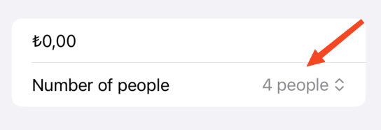
We may have noticed something here, we gave the numberOfPeople property a default value of 2, but it shows 4 in the picker. This is actually not a bug. Let’s think about it a bit; we create the picker using ForEach as follows;
ForEach(2 ..< 100) {This counts from 2 to 100 and creates a row. But in our line 0 it says “2 people”, when we give 2 as the default value, we mean the 3rd line of the picker [0,1,2...]. Since line 3 also says “4 people”, this is the default display of the picker.
Picker has many alternative styles. Here we will try a popular picker style, .pickerStyle(.navigationLink). This will open Picker’s options on a new page.
Picker("Number of people", selection: $numberOfPeople) {
    ForEach(2 ..< 100) {
        Text("\($0) people")
    }
}
.pickerStyle(.navigationLink)
But when we do this, we will see that the picker is unselectable and grayed out. This is because this modifier is designed to show the options on a new page, but since our application does not have a NavigationStack, the picker cannot open a new page and is therefore inactive.
Bunun için kodumuza NavigationStack’i aşağıdaki gibi ekleyebiliriz;
var body: some View {
    NavigationStack {
        Form {
            // Everything inside the form.
        }
    }
}
When we make the above change, we will see that the picker options are automatically shown on a new page and the default value is selected.
What we see here is what is called a declarative user interface. This means that instead of saying how we should do it, we say what we want. We said we wanted a navigation link picker with some values in it, but we didn’t need to say “create a list of all items, show a checkmark for whichever one is selected”.
Finally, we can add a title to the navigation bar. We can use the following modifier;
.navigationTitle("WeSplit")SwiftUI Segmented Control #
In our application, we will determine the tip as a percentage and we will use Segmented Control for this determination. Let’s add another section after the Section in our application;
Section {
    Picker("Tip percentage", selection: $tipPercentage) {
        ForEach(tipPercentages, id: \.self) {
            Text($0, format: .percent)
        }
    }
}
The code above will loop over the typePercentages Array, convert each of them into a text view in .percent format (%) and present it to us as a drop-down menu.
But here we want to use it as a segmented control. For this reason, let’s add the following code;
.pickerStyle(.segmented)Yes, it is good in this way, but when we look at our application from the user’s point of view, it will look nicer if we write an explanation to the percentages.
Section {
    Text("How much tip do you want to leave?")

    Picker("Tip percentage", selection: $tipPercentage) {
        ForEach(tipPercentages, id: \.self) {
            Text($0, format: .percent)
        }
    }
    .pickerStyle(.segmented)
}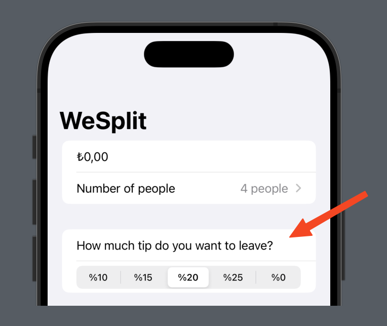
Yes it’s a nice idea, but our header looks like an element of the form. We can do better, SwiftUI allows us to add views to the header and footer of a section. We can revise our code as follows;
Section("How much tip do you want to leave?") {
    Picker("Tip percentage", selection: $tipPercentage) {
        ForEach(tipPercentages, id: \.self) {
            Text($0, format: .percent)
        }
    }
    .pickerStyle(.segmented)
}
Calculation of Total Amount per person #
We can use computed property to calculate the amount per person.
Therefore, we will create a computed variable called totalPerPerson and of type Double.
We can add totalPerPerson before the body property.
var totalPerPerson: Double {
    // calculate the total per person here
    return 0
}
Next, we can find out how many people there are by reading the numberOfPeople value and adding 2 to it. In this part, since our range is from 2 to 100 but we count from 0, we have to add 2 to the value we get.
Let’s start changing // calculate the total per person here;
let peopleCount = Double(numberOfPeople + 2)You may have noticed that we have converted the value to Double, because it will be used with checkAmount.
For the same reason, let’s convert typePercentage to Double;
let tipSelection = Double(tipPercentage)We will perform the calculation in our application in 3 steps.
- We can calculate the tip value by dividing
checkAmountby 100 and multiplying bytypeSelection. - By adding the tip value to
checkAmountwe can calculate the grand total of the account including tip. - Dividing the grand total by
peopleCountwe can find the amount per person.
Finally we can modify return 0 as follows.
let tipValue = checkAmount / 100 * tipSelection
let grandTotal = checkAmount + tipValue
let amountPerPerson = grandTotal / peopleCount

return amountPerPerson
Now that totalPerPerson has given us the correct value, we can add the last section to our Form.
Section {
    Text(totalPerPerson, format: .currency(code: Locale.current.currency?.identifier ?? "USD"))
}
SwiftUI Keyboard Hiding #
We are almost done with the project but you may have noticed one annoying thing, the keyboard never disappears. But we can avoid this with a few additions;
First we need to use the @FocusState property wrapper. This is like a nominal @State property except that it is designed to handle input focus in the user interface.
Let’s add the new property to ContentView;
@FocusState private var amountIsFocused: BoolNow we can add it to the Text Field so that amaountIsFocused is true when the text field is focused and false otherwise. Let’s add this modifier to TextField;
.focused($amountIsFocused)Second, when the text field is active, we need to add a button to the toolbar.
Let’s add the following code under the .navigationTitle() modifier;
.toolbar {
    if amountIsFocused {
        Button("Done") {
            amountIsFocused = false
        }
    }
}
Let’s analyze this code a bit;
- The
.toolbar()modifier allows us to specify a toolbar element for a view. These toolbar items can appear in various places on the screen (like the navigation bar at the top or the custom area at the bottom) - The condition checks if the variable
amountIsFocusedis currently true, so that we only show the button when the Text Field is active. - The
Buttonview we are using here shows some tappable text called “Done”. It also contains some code that will run when each button is pressed.
You can also read this article in Turkish.
Bu yazıyı Türkçe olarak da okuyabilirsiniz.